Product Display
Product detail interface
Table-view mode
By default, the Product Detail Interface shows single variant products with the option to change quantity and an "Add to Order" button.
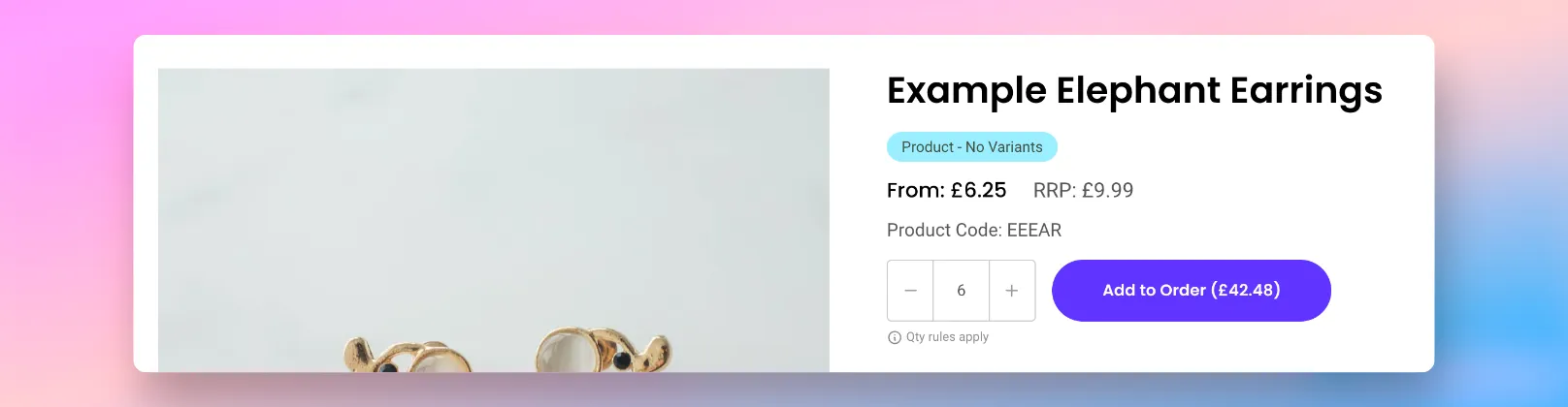
If you'd prefer, you can force all products to render in the special "table-view" mode, even if they only have a single variant.
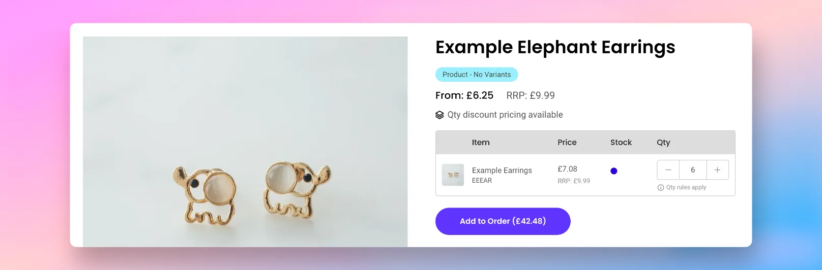
To enable this, simply add the below code:
<spark-pdp parent-id="{{ product.id }}" mode-table-only></spark-pdp>Please note Based on the platform you're using, the variable product.id will need to be adjusted to the appropriate setting.
"All Variants" mode
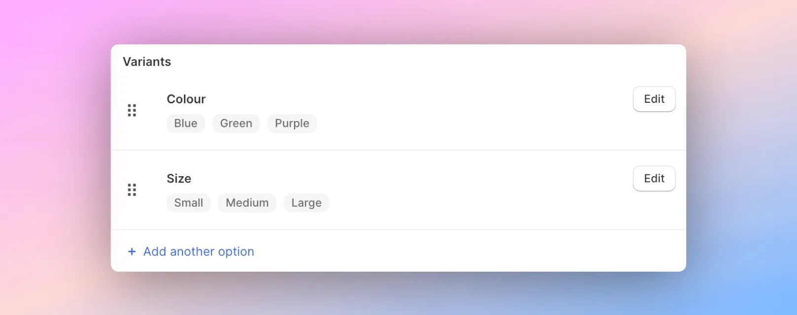
If your products are available in multiple variant options (e.g. colour, size, shape), it's possible to enable a special "All Variants" mode that gives customers an easy way to see all available variants.
Please note This differs from the 'standard' Product Detail Interface that shows variant options in a drop-down menu.
To enable this, simply add the below code to your product pages:
<spark-pdp parent-id="{{ product.id }}" mode-all-variants></spark-pdp>The "All Variants" mode will add additional columns to the Product Detail Interface which may interfere with the display on mobile devices by being too wide. You can optionally choose to hide columns from showing on mobile devices by using the below code:
<spark-pdp parent-id="{{ product.id }}" hide-on-mobile="colour,size" mode-all-variants></spark-pdp>The special "All Variants" mode takes the variants you've set up within your product catalogue, and will additionally order the list based on the ordering set within your product catalogue.
"Matrix" mode
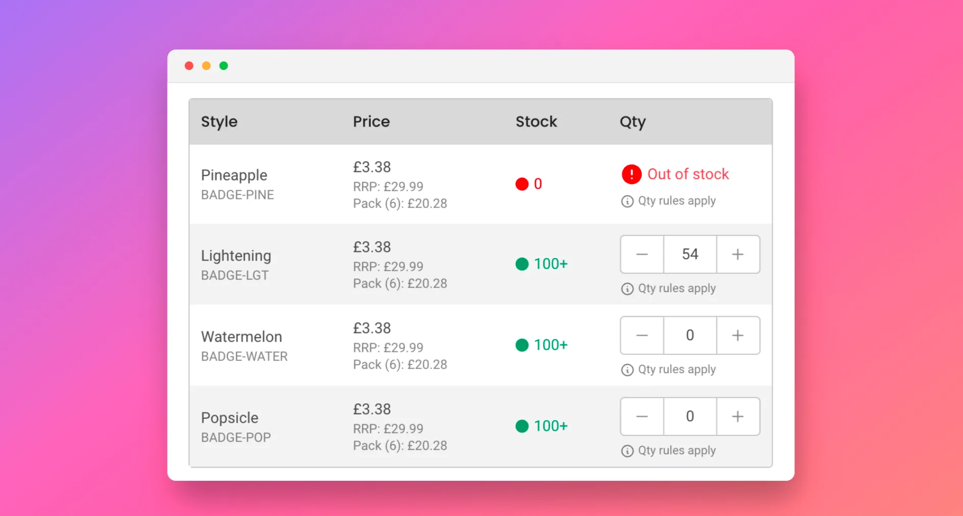
If your products are available in multiple variant options (e.g. colour, size, shape) and you want to display them in a "table" view, it's possible to enable a special Product Matrix Interface that gives customers an easy way to see all available variants. This can be used anywhere that products are displayed on your website and gives customers a rapid way to add products to an order.
Please note This differs from the 'standard' Product Detail Interface that shows variant options in a drop-down menu.
To enable this, simply add the below code to your product pages:
<spark-product-matrix parent-id="{{ product.id }}"></spark-product-matrix>If you would like to show the restock date in the Matrix, simply add the below code into your product pages:
<spark-product-matrix parent-id="{{ product.id }}" show-restock-date></spark-product-matrix>To learn more about how this works and how to implement it, please see our guide here.
Hiding the image in the table view
By default, the Product Detail Interface shows a thumbnail image of the variant within the layout. If you'd rather hide this, you can do this by adding a special CSS overwrite.
If you'd like this hidden, simply add the below CSS to your CSS overwrites.
<style>
:root {
    /* Default */
    --spark-pdp-image: table-cell;

    /* Add this to hide image */
    --spark-pdp-image: none;
}
</style>
Product code display (SKU)
By default, the Product Detail Interface shows the product code (SKU) within the layout, both for single variant products and multi-variant products (e.g. colour, size, etc).
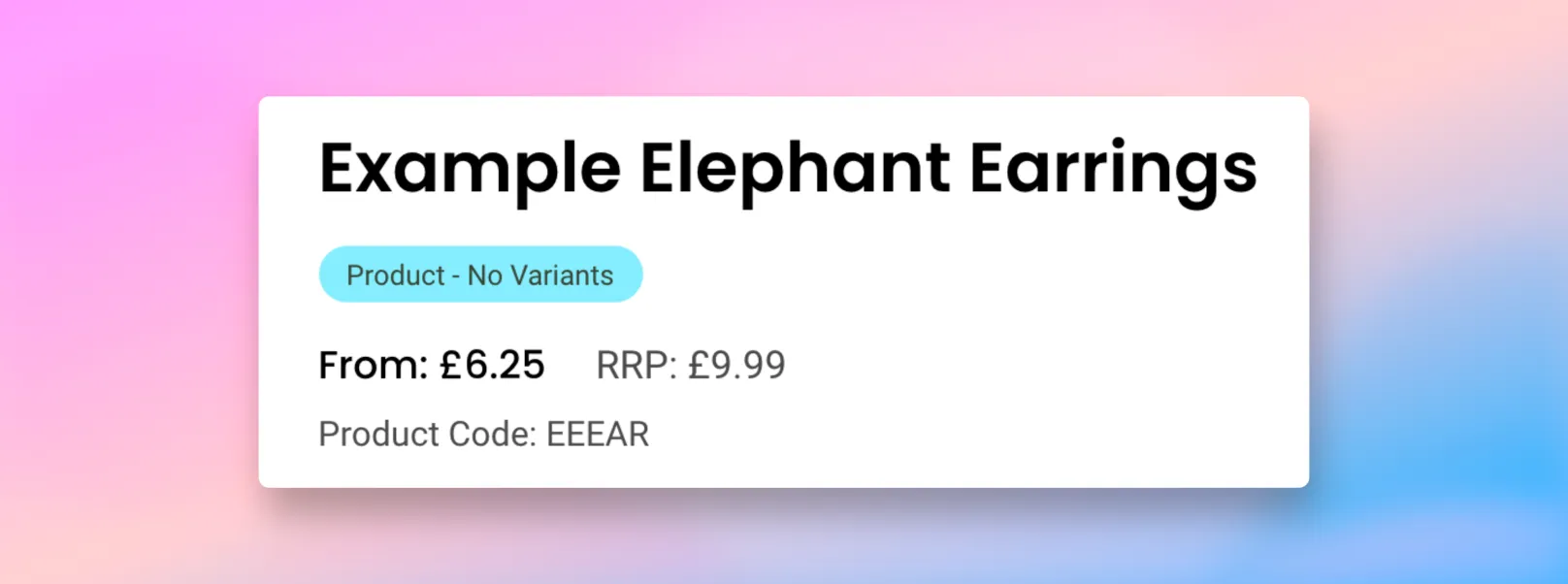
If you'd like this hidden, simply add the below CSS to your CSS overwrites.
<style>
:root {
    /* Default */
    --spark-pdp-sku: block;

    /* Add this to hide the SKU */
    --spark-pdp-sku: none;
}
</style>
You can also modify the term for SKU by editing the SparkLayer default language strings.
Updating language and text You can update the default text by adding code to your Core Script. Learn more about how to update text on SparkLayer.
/* Add the below code into the SparkLayer Core Script */
/* Please refer to our help guide on how to do this */
translations: {
  en: {
    "pdp.product-code": "Product Code",
  }
},
/* End of code */
Barcode display (ISBN, UPC, GTIN)
If your store is setup with barcodes for your products, you can optionally display these on the SparkLayer product page widgets.
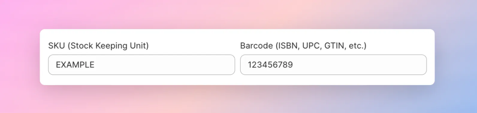
If you'd like the barcode to display, you'll need to make two changes within your theme code. For the product detail page widget, add show-barcode as shown below.
<spark-pdp show-barcode parent-id="{{ product.id }}"></spark-pdp>Once set up, the barcode will show clearly to customers when they visit a product page
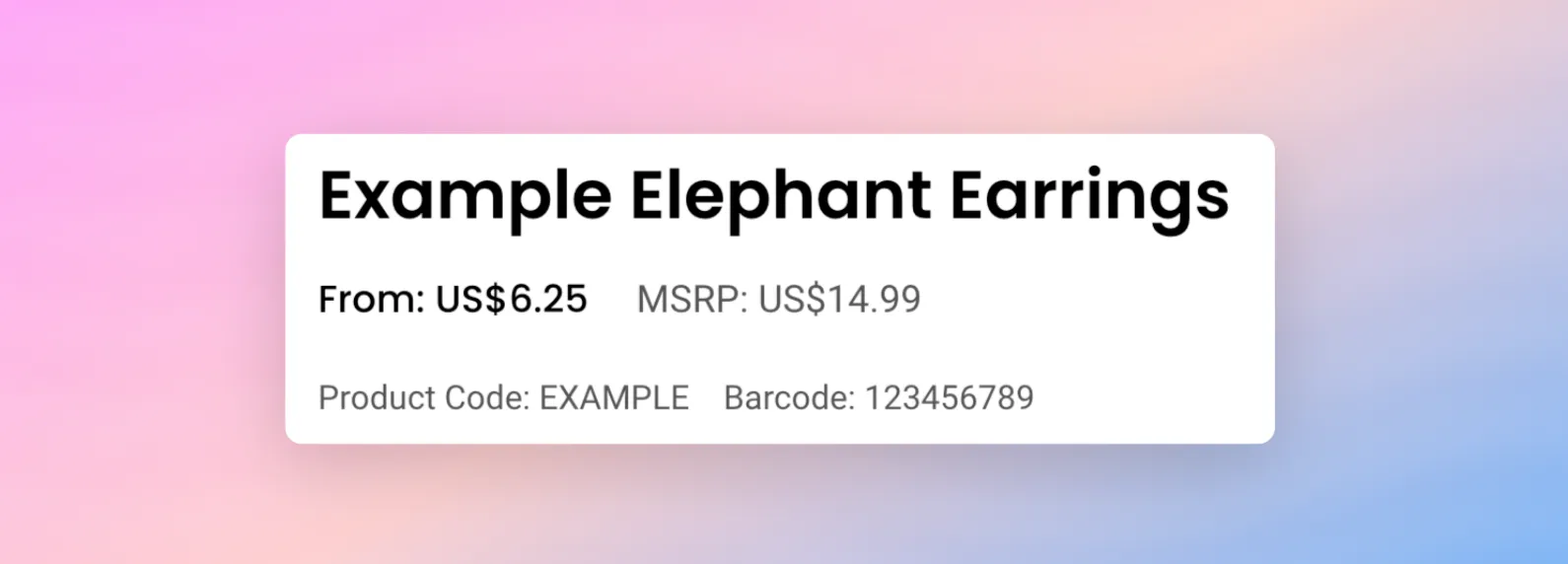
Updating language and text You can update the default text by adding code to your Core Script. Learn more about how to update text on SparkLayer.
/* Add the below code into the SparkLayer Core Script */
/* Please refer to our help guide on how to do this */
translations: {
  en: {
    "global.product.barcode": "Barcode",
  }
},
/* End of code */
Stock display
Looking to display live stock levels? Please refer to our full guide here.
Product card interface
Show stock status
It's possible to adjust the Product Card Interface to show live stock (inventory) levels to your customers, anywhere where this interface is shown.
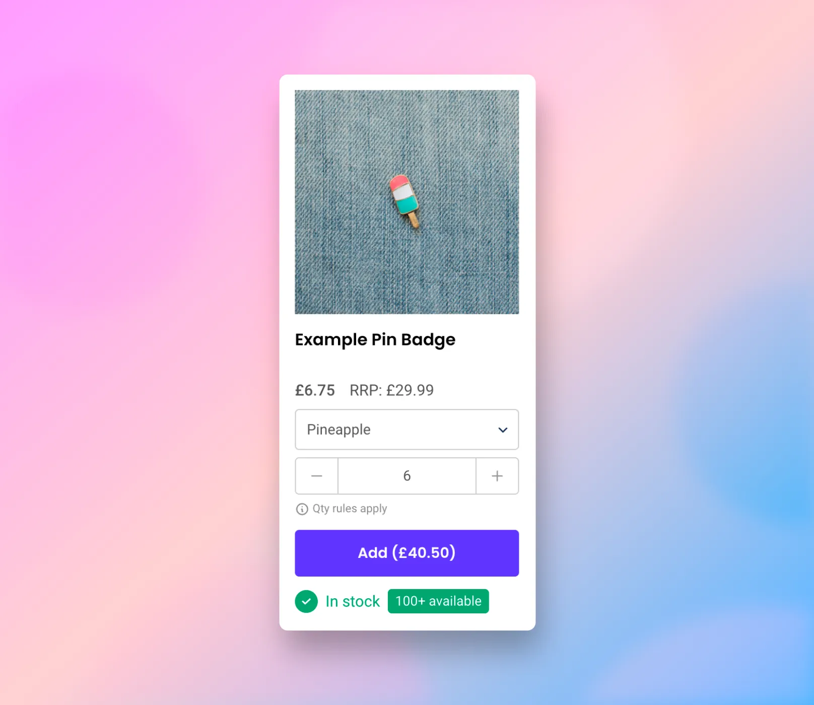
To enable this, simply use the following code.
<spark-product-card show-stock parent-id="{{ product.id }}"></spark-product-card>Please note Based on the platform you're using, the variable product.id will need to be adjusted to the appropriate setting.
Product code display (SKU)
It's possible to adjust the Product Card Interface to show the product code (SKU) to your customers, anywhere where this interface is shown.
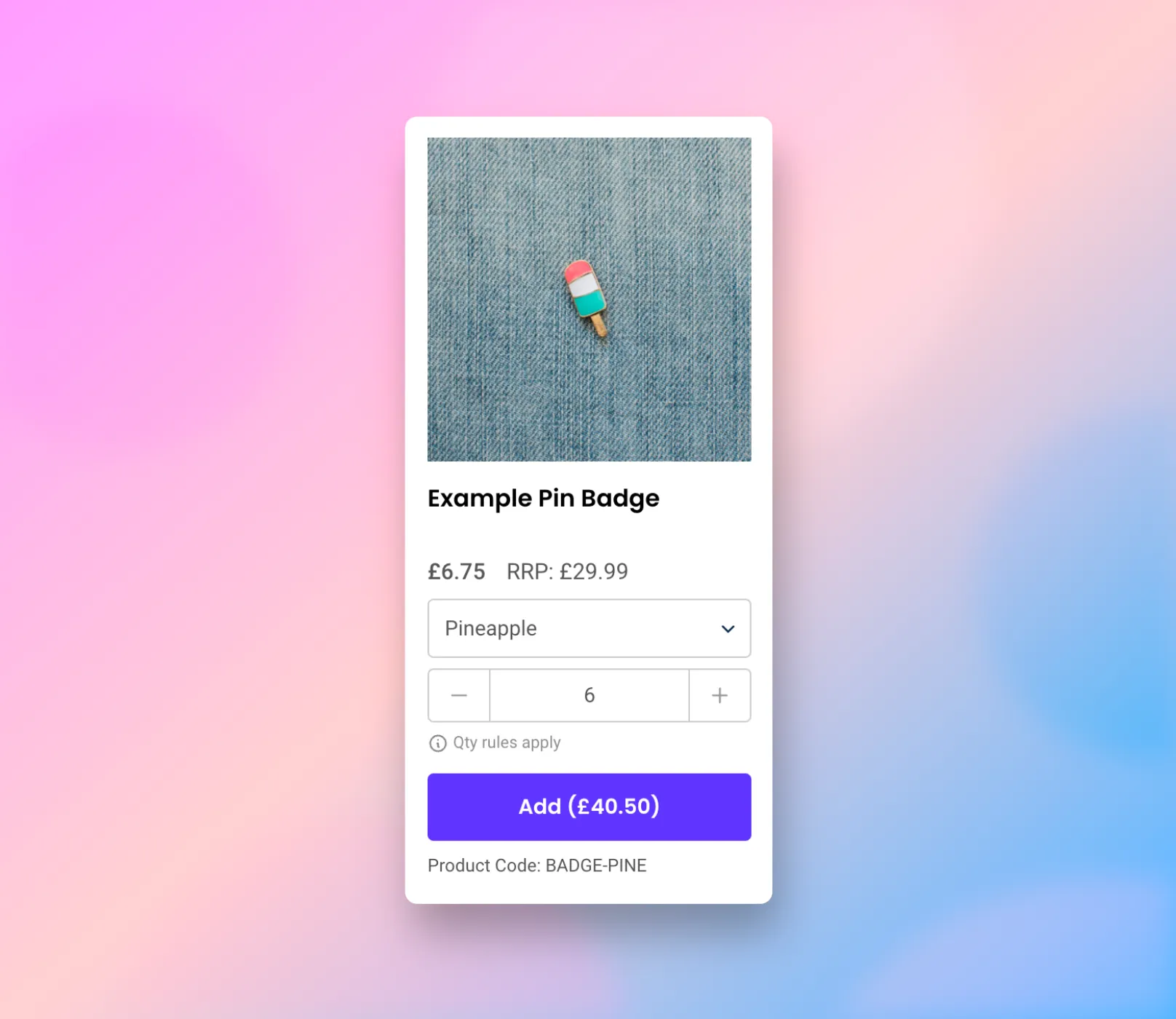
To enable this, simply use the following code.
<spark-product-card show-sku parent-id="{{ product.id }}"></spark-product-card>Please note Based on the platform you're using, the variable product.id will need to be adjusted to the appropriate setting.
Barcode display (ISBN, UPC, GTIN)
It's possible to adjust the Product Card Interface to show the barcode to your customers, anywhere where this interface is shown.
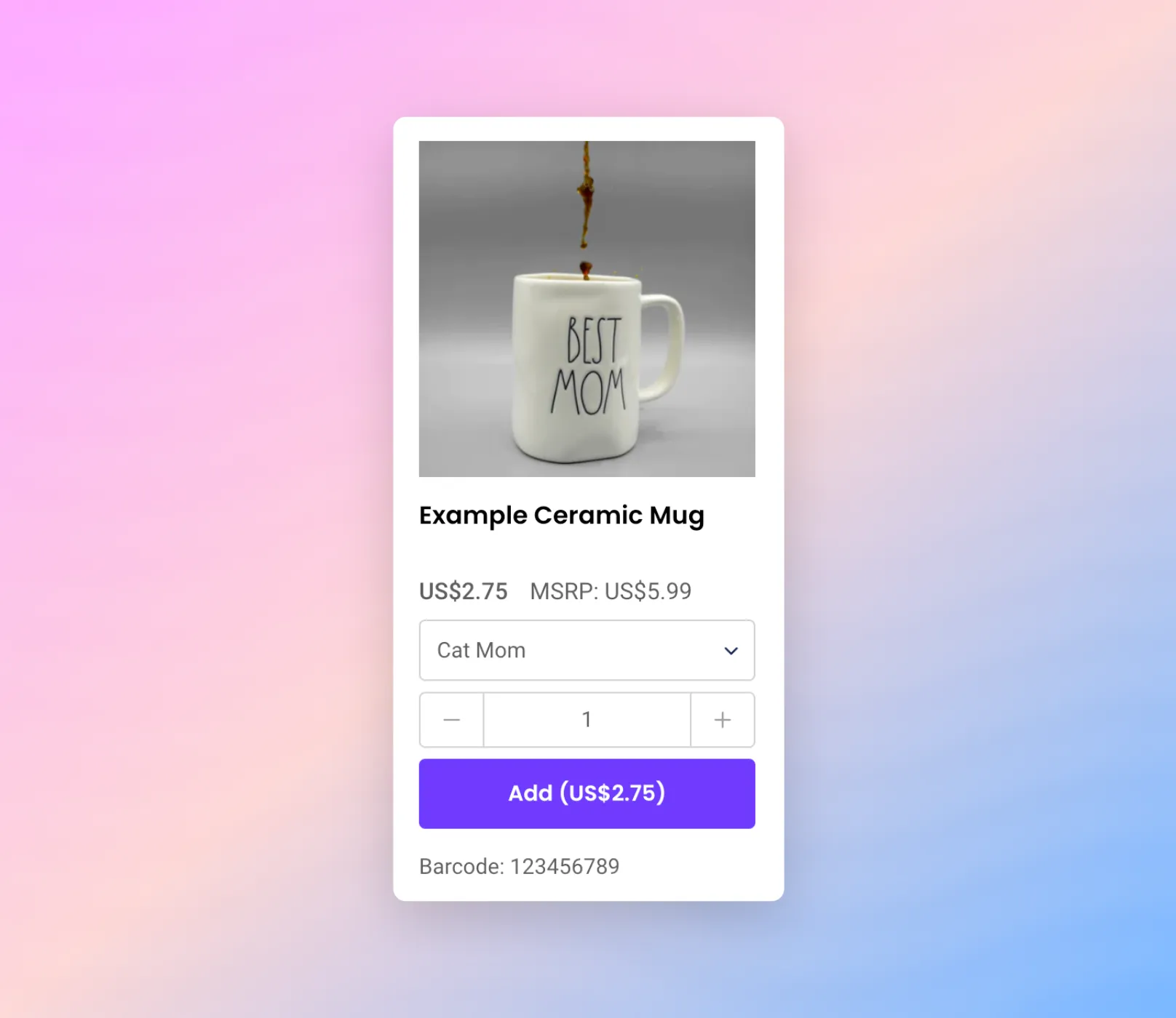
To enable this, simply use the following code.
<spark-product-card show-barcode parent-id="{{ product.id }}"></spark-product-card>Please note Based on the platform you're using, the variable product.id will need to be adjusted to the appropriate setting.
Hide variant drop-downs
It's possible to adjust the Product Card Interface to hide variant drop-downs from showing. For example, you may have a product that has a variant group of "Size" with only one option and you'd prefer not to show the drop-down.
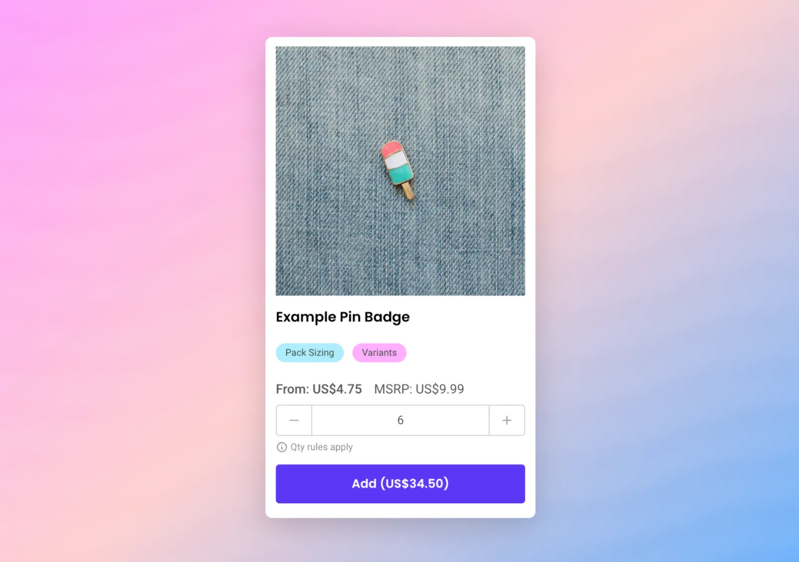
To enable this, simply use the following code, replacing hide-dropdown="Size, Colour" with the appropriate option group names from your platform.
<spark-product-card hide-dropdown="Size, Colour" parent-id="{{ product.id }}"></spark-product-card>Please note Based on the platform you're using, the variable product.id will need to be adjusted to the appropriate setting.
Hide price from button
If you'd prefer to now show a "total price" in the "Add" button that shows in the product card, it's possible to remove this by adding (and modifying) a special language string.
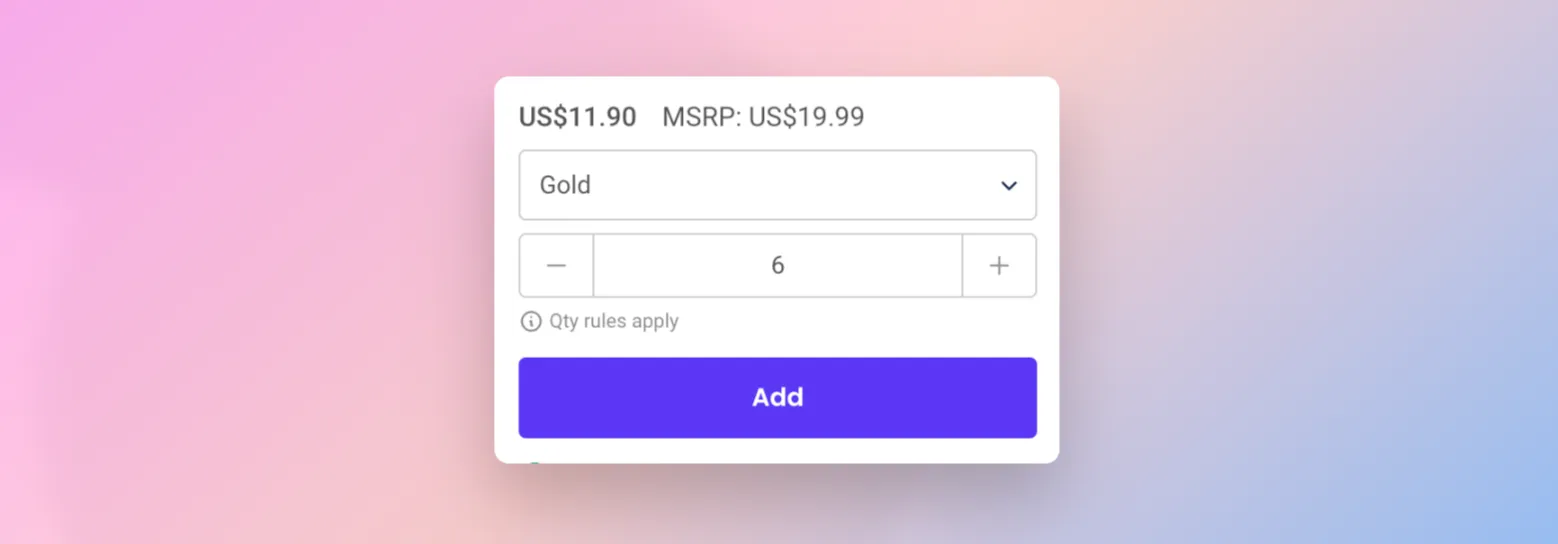
Updating language and text You can update the default text by adding code to your Core Script. Learn more about how to update text on SparkLayer.
/* Add the below code into the SparkLayer Core Script */
/* Please refer to our help guide on how to do this */
translations: {
  en: {
     "product-card.add-to-order.cta-text":"Add ({price})",
 }
},
/* End of code */
Product variant-specific display (e.g. hiding)
Within the Product Detail Interface and Product Card Interface, it's possible to isolate specific variants to have variant-specific behaviour applied to them.
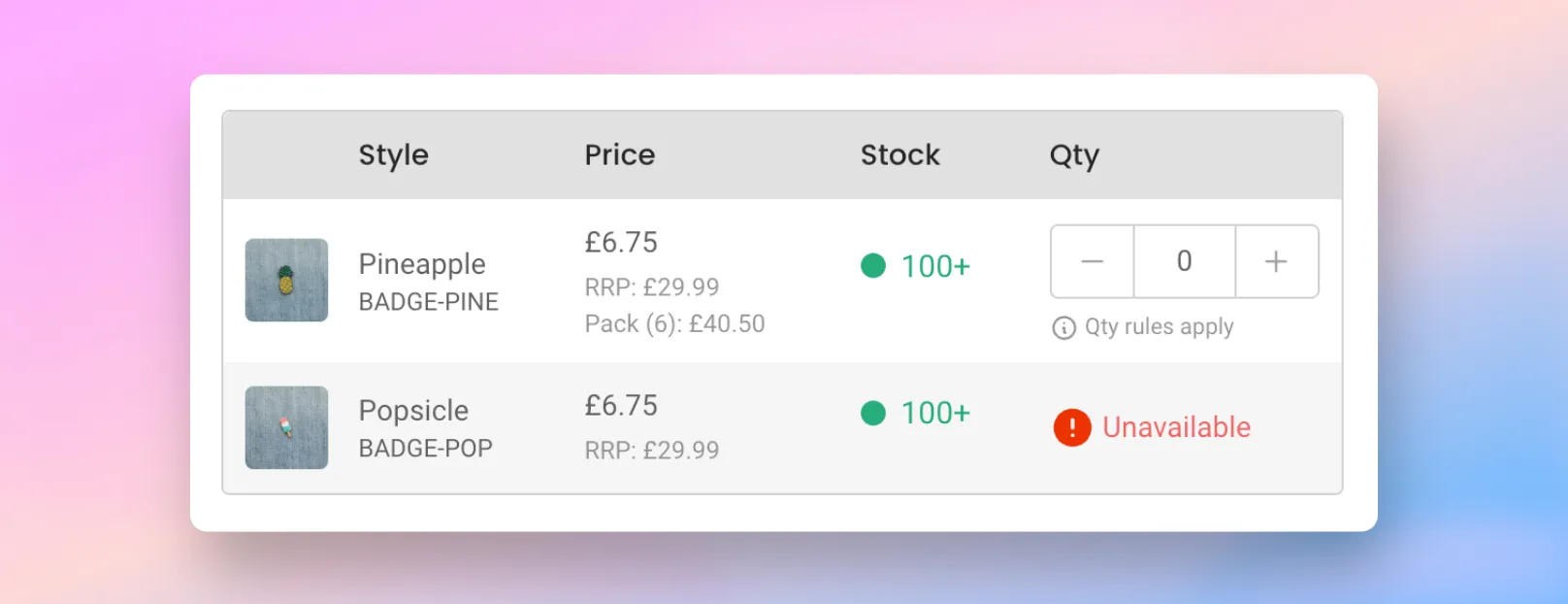
Currently this includes the following:
Behaviour | Details |
|---|---|
Hide specific variants | Within the SparkLayer interfaces, specific variants can be hidden from view, either globally (for all B2B customers) or for specific customer groups |
Set specific variants to "un-sellable" | Within the SparkLayer interfaces, specific variants can be set to "un-sellable", resulting in them displaying to the customer as "Unavailable" to purchase. |
To enable this, SparkLayer uses special settings (sometimes referred to as metafields or attributes) that allow additional data to be stored against products.
Setting up metafields on Shopify 🤖 Automatically add this to your Shopify store by going to configure metafields. 📖 Learn more about how metafields work in our guide here
Hiding specific variants
Item | Details |
|---|---|
Custom data type | Variants |
Metafield type | This must be set as JSON |
Namespace | This must be set as sparklayer |
Key | This must be set as settings |
Value | This must be set in the following format [{"customer_group":"base","display":false}] To apply to multiple customer groups, you can use this format: [{"customer_group": "base","display": true},{"customer_group": "b2b-group1","display": false}] |
Set specific variants to "un-sellable"
Item | Details |
|---|---|
Custom data type | Variants |
Metafield type | This must be set as JSON |
Namespace | This must be set as sparklayer |
Key | This must be set as settings |
Value | This must be set in the following format [{"customer_group":"base","sell":false}] To apply to multiple customer groups, you can use this format: [{"customer_group": "base","sell": true},{"customer_group": "b2b-group1","sell": false}] |
Product settings You can learn more about product settings in our full guide here.
Add to Favourites
Your B2B customers can save products for later using the heart icon, which appears on the product detail interface next to the Add to cart button and on product cards across your collection pages. Saved products are collected in a Favourites section within My Account, where customers can return to them and add them to the cart whenever they're ready.
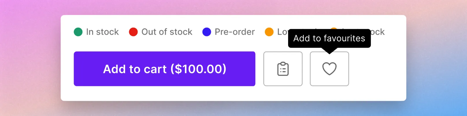
Favourites are turned on by default. If you'd prefer not to show the heart icon, you can turn Favourites off from Storefront → Options in the SparkLayer dashboard, under My Account Settings.
Learn more in our full guide here.
Quick Buy Mode
Important - please note The customisations detailed in this guide are recommendations only and may vary in complexity, depending on how your store is set up. Whilst the SparkLayer team can advise on how to approach implementing these recommendations, our team may not be equipped to implement them on your Shopify store. We recommend engaging a developer assist should you wish to proceed with any of the recommendations below.
It's possible to adapt the SparkLayer interface to display in "Quick buy mode" that allows customers to more rapidly build orders from your product collection pages.
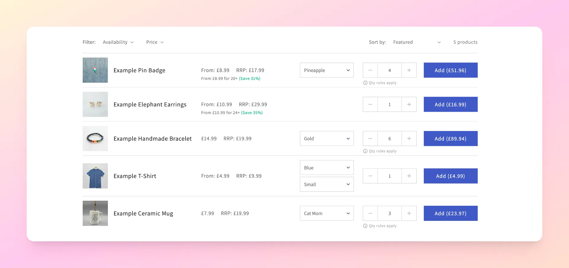
To enable this feature, you can adapt the Product Card Interface with a special setting that adjusts the layout to a "table-view". Simply add the code below to any product collection page.
<spark-product-card mode-quick-buy parent-id="{{ product.id }}"></spark-product-card>
Please note Based on the platform you're using, the variable product.id will need to be adjusted to the appropriate setting.
If you're using the Shopify B2B Dawn Theme, this is enabled by default, and it's also possible to manually enable this on most Shopify themes. To enable quick buy mode, you'll need to follow the below steps within your Shopify theme codebase.
- Within /templates/ create a duplicate of your default collections layout
- Within /sections/ create a duplicate of your default collections section layout
- Within /snippets/ create a new file with the following code
- Adjust the theme code in the new /sections/ collection section layout to render the new /snippet/ file that has the special 'quick buy mode' enabled
- Add the following CSS to your code
To enable quick buy mode, within Shopify, go to Products and click Collections and then edit the collection page you wish to apply this to. From the Theme template section, simply choose 'quick buy' from the list of options and click save.
Important to note If you apply the new 'quick buy mode' to your collection pages, this will also take effect for logged-out customers also. If you are looking to customise the behaviour of how this works, we recommend engaging a Shopify expert to assist.
Product customisations
If you sell products that require "customisations" such as custom text or any other unique requirements, it is possible to support these via SparkLayer's more advanced JavaScript SDKJavaScript SDK option.
This allows your B2B customers to add customised text to products within their order and the information is sent through to your eCommerce platform when an order is placed.
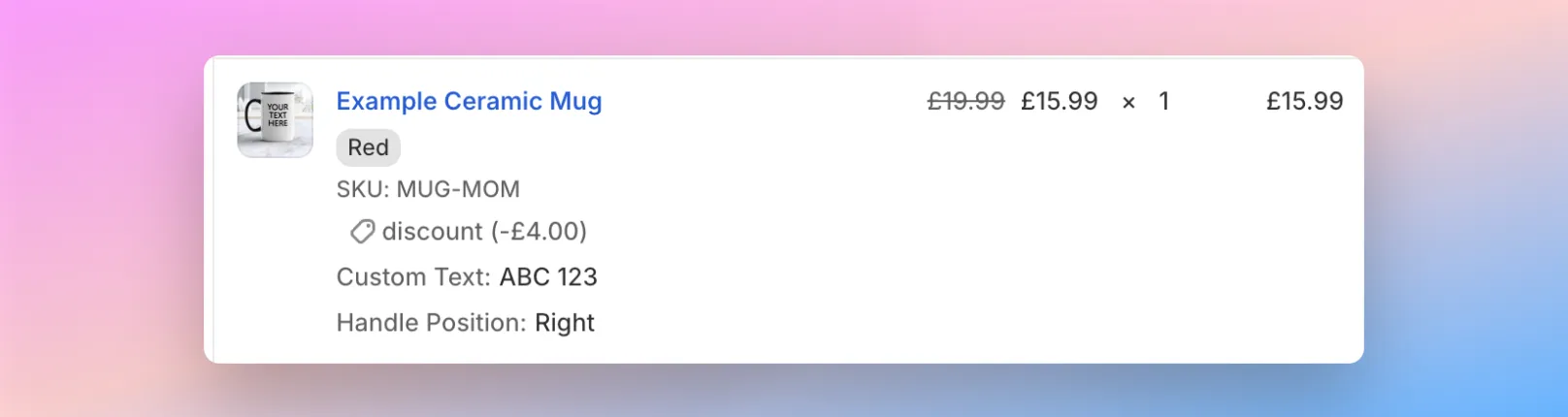
Please note This is an advanced configuration of SparkLayer and will require a developer to implement on a store that requires this feature. Please refer to our JavaScript SDKJavaScript SDK for full details.
1-click ordering (product bundles)
It's possible to create special buttons on your store that allow customers to add collections of products to an order, rather than having to add them all individually. These are called "Spark Buttons".
Spark Buttons work by adding special snippets of JavaScript to your website that specify which SKUs and quantities will be added when a user clicks the button. These buttons can work anywhere on your website such as the homepage or special landing pages.
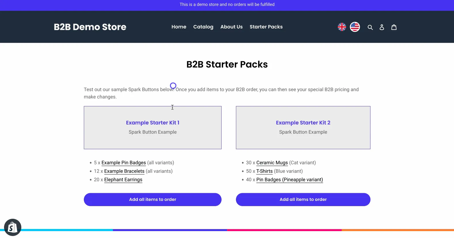
Live Demo Test this out for yourself on our B2B Demo store!Note: you'll need to be signed in first to test this feature.
Example use-cases
Spark Buttons are useful if you're looking to direct B2B customers to purchase a specific range of products. Examples could include:
- Starter packs for brand new customers, e.g. your best-selling products
- A curated range of products, e.g. a new season range
- A product bundle, e.g. the top 10 products from a certain category
Once the customer adds the items to the order, they can then make changes just as they would do normally, e.g. editing quantities, removing items, etc.
Enabling Spark Buttons
Spark Buttons can be added anywhere on your store using the sample code template below. In this example, we've include two buttons with each button adding different product SKUs and different quantities.
When using Spark Buttons, please note the following:
Item | Details |
|---|---|
Inserting multiple buttons | You can insert multiple Spark Buttons on a single page providing that unique querySelectors are used. For example, in our code sample above, we've included two buttons: data-add-to-cart and data-add-to-cart2 |
Product SKUs | For Spark Buttons to successfully add products, the product SKU must also exist within your Shopify store |
Product quantities | You can specify the product quantity to add by using absoluteQuantity. If the product SKU has pack sizes configured, the quantity will automatically be rounded up. |
Please note Using this feature requires custom JavaScript coding and you may want to engage a Shopify expert to assist. Our team may not be able to directly advise on the best approach due to the custom nature of this feature.
B2B-only products (Hiding products)
If you're running both B2B and DTC within the same Shopify store, there may be a range of products that you want to only show and be purchasable to logged in B2B customers.
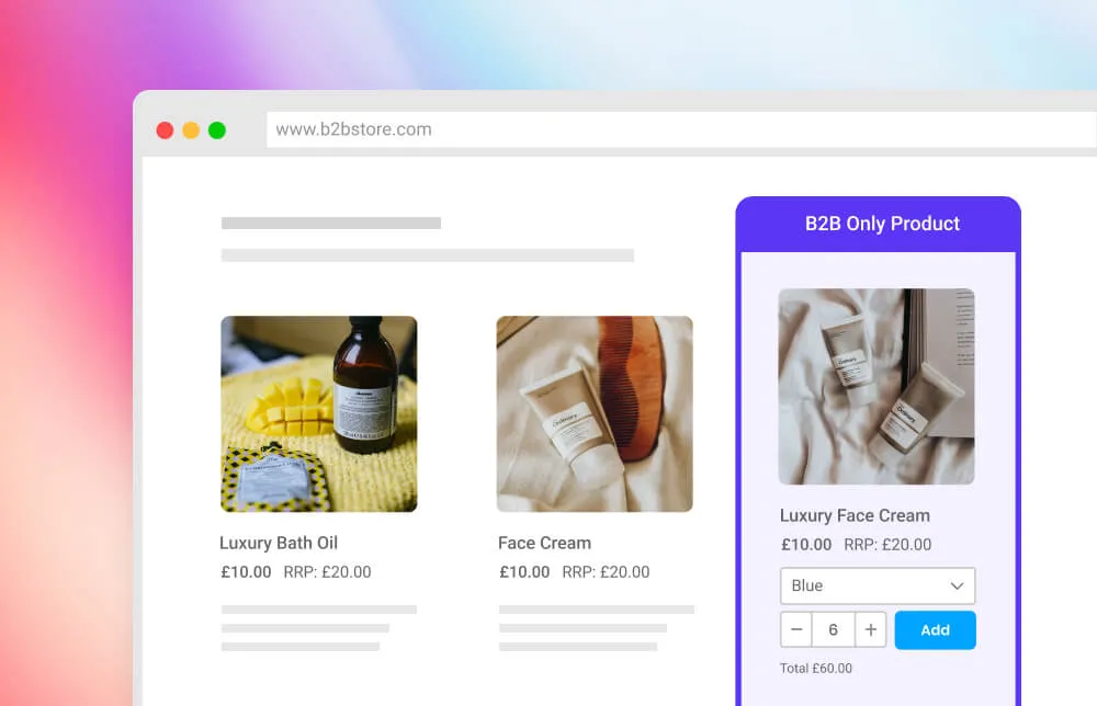
Perhaps they can only be purchased in high-volumes or they are exclusive to your B2B customers.
The good news is there are ways to do this and we've detailed more in our guides below.
Learn more in our guide here
Updating the "Add to Cart" button text
If you'd prefer to update the text shown on the "Add to Cart" buttons on the Frontend Interfaces, you can modify the default language strings to do so.

Updating language and text You can update the default text by adding code to your Core Script. Learn more about how to update text on SparkLayer.
/* Add the below code into the SparkLayer Core Script */
/* Please refer to our help guide on how to do this */
translations: {
  en: {
    "product-card.add-to-order.cta-text": "Add ({price})",
    "pdp.add-to-order.cta-text": "Add to Cart ({price})"
  }
},
/* End of code */