Customising the Design
Introduction
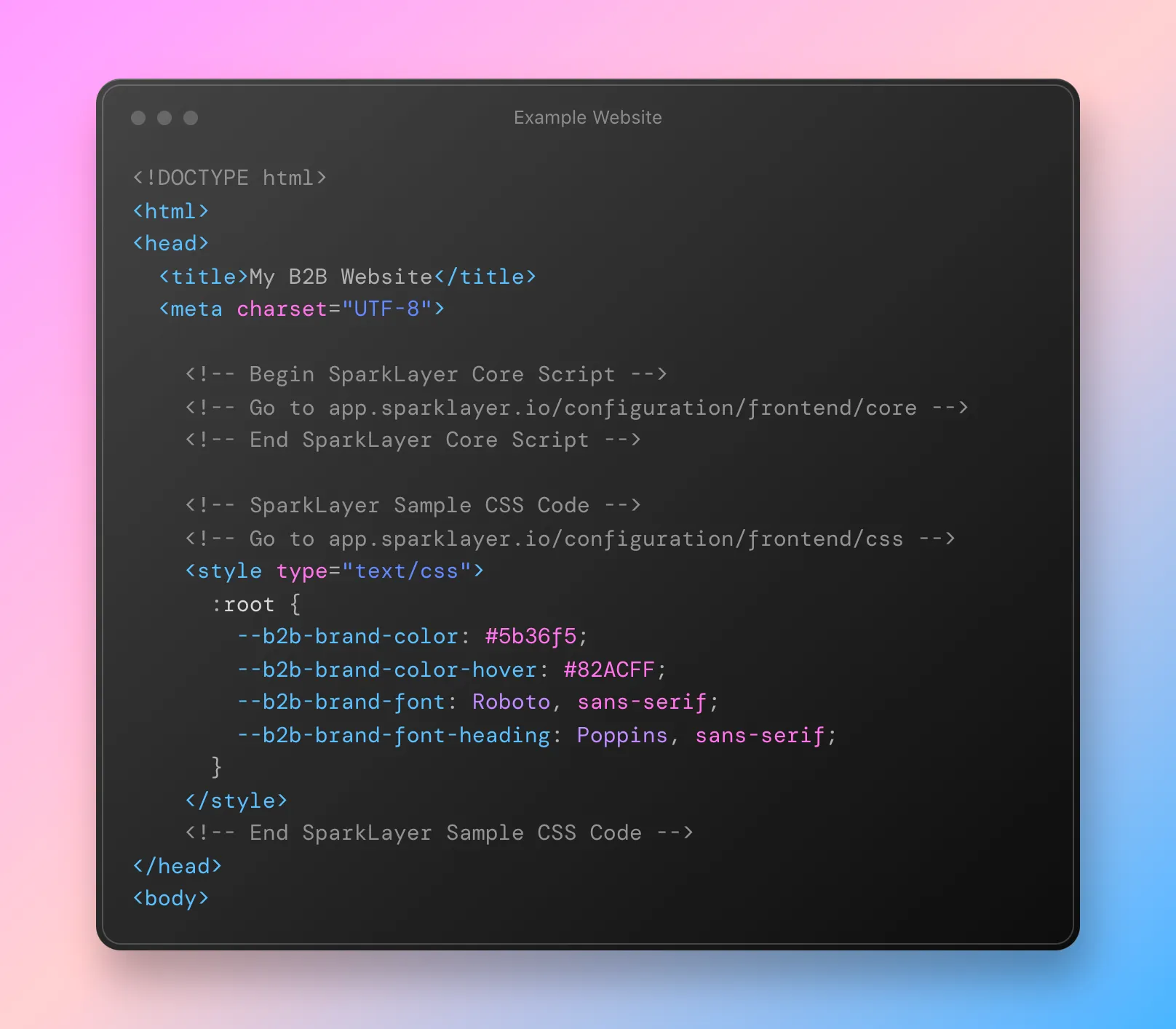
By default, the Frontend has relatively basic styling and tries to keep things as neutral as possible. In order to allow SparkLayer to be styled to match the theme and branding of your website, a large selection of variables are exposed that can be customised via adding special CSS variables to your store.
Please note If you're unable to style an element to your exact needs, please contact us and we'll be happy to advise on the best approach.
Applying the customisations
The customisations work by adding special snippets of CSS to the code of your website that subsequently then overwrite the "default" styling for SparkLayer.
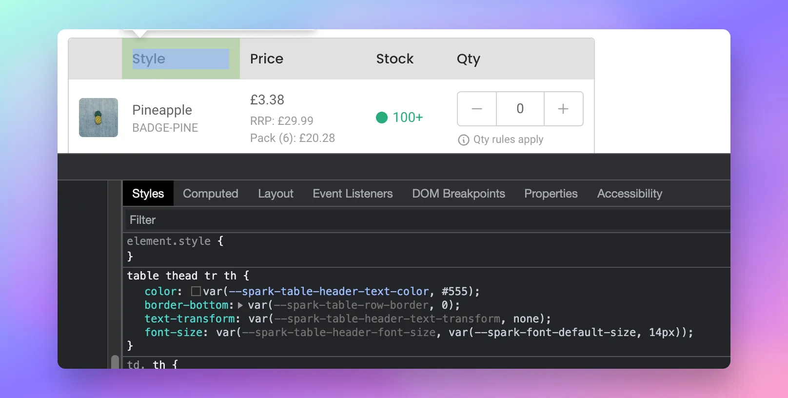
In your web browser, it's possible to isolate and view the variables really easily - by inspecting element, you'll see the variable names in the Developer Tools section
Making code changes To learn more about how to apply code changes, please refer to our Frontend Integration Guide for full details.
Best-practise CSS
We've included our best-practise CSS below to get you started.
<!-- SparkLayer Sample CSS Code -->

<style type="text/css">

:root {
  /* Set the brand styling */
  --b2b-brand-color: #000; /* Main brand colour */
  --b2b-brand-color-hover: #333; /* Main brand colour hover */
  --b2b-brand-font: Arial, sans-serif; /* Main brand font */
  --b2b-brand-font-heading: Arial, sans-serif; /* Main brand heading font */

  /* Update colours */
  --spark-default-body-color: #555555; /* Main body colour */
  --spark-primary-color: #000000; /* Main title colour */
  --spark-secondary-color: var(--b2b-brand-color); /* Main highlight colour */
  --spark-link-color: var(--b2b-brand-color); /* Link colour */

  /* Typefaces */
  --spark-font-default: var(--b2b-brand-font); /* Body typeface */
  --spark-font-highlight: var(--b2b-brand-font-heading); /* Highlight typeface */
  --spark-font-weight-default: 400; /* Default font weight */
  --spark-font-weight-medium: 500; /* Medium font weight */
  --spark-font-weight-heavy: 600; /* Bold font weight */

  /* General */
  --spark-border-radius-default: 0; /* Default border radius */
  --spark-drawer-max-width: 700px; /* Width of overlay */
  --spark-drawer-max-width-wide: 1000px; /* Width of overlay in maximised view */

  /* Font sizes */
  --spark-font-default-size: 14px; /* Default font size*/
  --spark-font-default-size-small: 14px; /* Default font size - small screens */
  --spark-header-font: var(--b2b-brand-font-heading); /* Header typeface */
  --spark-header-font-weight: 500; /* Header font weight */
  --spark-h1-fontsize: 24px; /* Header 1 font size */
  --spark-h2-fontsize: 22px; /* Header 2 font size */
  --spark-h3-fontsize: 20px; /* Header 3 font size */
  --spark-h4-fontsize: 16px; /* Header 4 font size */
  --spark-h5-fontsize: 15px; /* Header 5 font size */
  --spark-h6-fontsize: 14px; /* Header 6 font size */

  --spark-pricing-fontsize: 20px; /* Font size of pricing */
  --spark-pricing-font-weight: 500; /* Font weight of pricing */
  --spark-pricing-fontsize-small: 14px; /* Font size of pricing on mobile */

  --spark-product-code-fontsize: 16px; /* Font size of product code */
  --spark-product-code-font-weight: 500; /* Font weight of product code */
  --spark-product-code-fontsize-small: 14px; /* Font size of product code on mobile */
  --spark-product-stockstatus-align: flex-start; /* Alignment of stock status for single variants */

  /* Buttons */
  --spark-button-font-family: var(--b2b-brand-font-heading); /* Button typeface */
  --spark-button-color: var(--b2b-brand-color); /* Default sutton colour */
  --spark-button-color-highlight: var(--b2b-brand-color-hover); /* Default button colour hover */
  --spark-button-large-color: var(--b2b-brand-color); /* Large button colour */
  --spark-button-large-color-highlight: var(--b2b-brand-color-hover); /* Large button colour hover */
  --spark-border-radius-button: 0; /* Button border radius */
  --spark-button-font-weight: 600; /* Button font weight */
  --spark-button-text-transform: none; /* Button text transform */
  --spark-button-text-letter-spacing: 0; /* Button letter spacing */
  --spark-button-padding: 1em 2.75em; /* Button padding */
  --spark-button-small-font-size: 16px; /* Small button font size */

  /* Tables */
  --spark-table-border-color: #CCCCCC; /* Table border colour */
  --spark-table-header-background-color: #F1F1F1; /* Table header background */
  --spark-table-header-text-color: #222222; /* Table header font colour */
  --spark-table-header-font-weight: 500; /* Table header font weight */

  /* Product Card */
  --spark-product-card-button-radius: 0; /* Button radius */
  --spark-product-card-button-padding: 0.75em 1em; /* Button padding */
  --spark-product-card-pricing-font-size: 15px; /* Pricing font size */
  --spark-product-card-pricing-font-size-small: 14px; /* Pricing font size on mobile */
  --spark-product-card-select-min-height: 0; /* Set a min-height for select menu */
}
</style>

<!-- End SparkLayer Sample CSS Code -->
Colours
<style>
:root {
    /* Colours */
    --spark-default-body-color: #555555;
    --spark-primary-color: #000000;
    --spark-primary-color-light: #F5F5F5;
    --spark-primary-color-dark: #999999;
    --spark-secondary-color: #125EF8;
    --spark-tertiary-color: #00AF76;
    --spark-lightest-color: #FFFFFF;
    --spark-success-color: #00AF76;
    --spark-error-color: #EF0000;
    --spark-warn-color: #FF9243;
    --spark-link-color: #125EF8;
    --spark-input-color: #CCCCCC;
}
</style>
Variable | Description & usage | Default Value |
|---|---|---|
--spark-default-body-color | Body font colour | #555555 |
--spark-primary-color | Title font colour, e.g. price information | #000000 |
--spark-primary-color-light | Light shading, e.g. table shading | #F5F5F5 |
--spark-primary-color-dark | Dark shading | #999999 |
--spark-secondary-color | Secondary colour, e.g. a highlight colour | #125EF8 |
--spark-tertiary-color | Tertiary colour, e.g. large button colour | #00AF76 |
--spark-lightest-color | Lightest colour, e.g .white | #FFFFFF |
--spark-success-color | Success message colour | #00AF76 |
--spark-error-color | Error message colour | #EF0000 |
--spark-warn-color | Warning message colour | #EDC35C |
--spark-link-color | Anchor link colour | #125EF8 |
--spark-input-color | Form fields border colour | #CCCCCC |
Typography
About embedded fonts
SparkLayer by default uses two typefaces on the Frontend
- Body font: Roboto
- Highlight font: Poppins
It's possible to overwrite these using the variables listed below. If you do require custom fonts for SparkLayer (e.g. using Google Fonts), please ensure these are included in your website's core CSS file and included in your site header if necessary.
<style>
:root {
    /* Typography */
    --spark-font-default: 'Roboto', sans-serif;
    --spark-font-highlight: 'Poppins', sans-serif;
    --spark-font-weight-default: 400;
    --spark-font-weight-light: 300;
    --spark-font-weight-medium: 500;
    --spark-font-weight-heavy: 600;
    --spark-header-font: 'Poppins', sans-serif;
    --spark-header-font-weight: 500;
    --spark-header-text-transform: none;
    --spark-header-letter-spacing: 0eml
    --spark-h1-fontsize: 24px;
    --spark-h2-fontsize: 22px;
    --spark-h3-fontsize: 20px;
    --spark-h4-fontsize: 16px;
    --spark-h5-fontsize: 15px;
    --spark-h6-fontsize: 14px;
    --spark-pricing-fontsize: 16px;
    --spark-pricing-font-weight: 400;
    --spark-pricing-fontsize-small: 14px;
    --spark-packsize-fontsize: 16px;
    --spark-packsize-font-weight: 400;
    --spark-packsize-fontsize-small: 14px;
    --spark-product-code-fontsize: 16px;
    --spark-product-code-font-weight: 400;
    --spark-product-code-fontsize-small: 14px;
    --spark-product-stockstatus-fontsize: 16px;
    --spark-product-stockstatus-fontsize-small: 14px;
    --spark-product-stockstatus-align: flex-start;
    --spark-product-stockstatus-back-order-display: flex;
}
</style>
Variable | Description | Default Value |
|---|---|---|
--spark-font-default | Main body font | 'Roboto', sans-serif |
--spark-font-highlight | Highlight font | 'Poppins', sans-serif |
--spark-font-weight-default | Default font weight | 400 |
--spark-font-weight-light | Light font weight | 300 |
--spark-font-weight-medium | Medium font weight | 500 |
--spark-font-weight-heavy | Heavy font weight | 600 |
--spark-header-font | Header font | 'Poppins', sans-serif |
--spark-header-font-weight | Header font weight | 500 |
--spark-header-text-transform | Header transform | none |
--spark-header-letter-spacing | Header character spacing | 0em |
--spark-h1-fontsize | H1 font size | 24px |
--spark-h2-fontsize | H2 font size | 22px |
--spark-h3-fontsize | H3 font size | 20px |
--spark-h4-fontsize | H4 font size | 16px |
--spark-h5-fontsize | H5 font size | 15px |
--spark-h6-fontsize | H6 font size | 14px |
--spark-pricing-fontsize | Pricing font size | 16px |
--spark-pricing-font-weight | Price font weight | 500 |
--spark-pricing-fontsize-small | Price font size on mobile | 14px |
--spark-packsize-font-weight | Pack sizing font size | 16px |
--spark-packsize-fontsize | Pack sizing font weight | 400 |
--spark-packsize-fontsize-small | Pack sizing font size on mobile | 14px |
--spark-product-code-fontsize | Product code font size | 16px |
--spark-product-code-font-weight | Product code font weight | 500 |
--spark-product-code-fontsize-small | Product code font size on mobile | 14px |
--spark-product-stockstatus-align | The alignment of the stock status message | flex-start |
--spark-product-stockstatus-back-order-display | The display of the Pre-order message | flex |
General
<style>
:root {
    /* General */
    --spark-border-radius-default: 4px;
    --spark-border-radius-large: 8px;
    --spark-drawer-max-width: 700px;
    --spark-drawer-max-width-wide: 1000px;
    --spark-loading-background-color: #DEDEDE;
    --spark-loading-background-overlay-product: 255, 255, 255;
    --spark-container-content-top: 3em;
    --spark-container-content-bottom: 3em;
    --spark-container-content-side: 4.5em;
    --spark-container-content-reduced: 1.5em;
    --spark-spinner-default-color: #125EF8;
}
</style>
Variable | Description | Default Value |
|---|---|---|
--spark-border-radius-default | Default border radius | 4px |
--spark-border-radius-large | Overlay border radius | 8px |
--spark-drawer-max-width | Width of overlay | 700px |
--spark-drawer-max-width-wide | Width of overlay in 'maximised' view | 1000px |
--spark-loading-background-color | Loading 'skeleton' colour | #DEDEDE |
--spark-loading-background-overlay-product | Loading overlay colour on product pages | 255,255,255 |
--spark-container-content-top | Overlay spacing - top | 3em |
--spark-container-content-bottom | Overlay spacing - bottom | 3em |
--spark-container-content-side | Overlay spacing - sides | 4.5em |
--spark-container-content-reduced | Overlay spacing - reduced | 1.5em |
--spark-spinner-default-color | Loading spinner colour | #125EF8 |
Buttons
General
<style>
:root {
    /* Buttons */
    --spark-button-font-family: 'Poppins', sans-serif;
    --spark-button-border: 0;
    --spark-button-font-size: 15px;
    --spark-button-font-weight: 400;
    --spark-button-padding: 0.875em 1.75em;
    --spark-button-radius: 4px;
    --spark-button-text-transform: none;
    --spark-button-text-letter-spacing: 0;
    --spark-button-raised-background: #25EF8;
    --spark-button-raised-background-hover: #508AFF;
    --spark-button-raised-color: #FFFFFF;
}
</style>
Variable | Description | Default Value |
|---|---|---|
--spark-button-font-family | Button font | 'Poppins', sans-serif |
--spark-button-border | Button border | 0 |
--spark-button-font-size | Button font size | 15px |
--spark-button-font-weight | Button font weight | 400 |
--spark-button-padding | Button padding | 0.875em 1.75em |
--spark-button-radius | Button border radius | 4px |
--spark-button-text-transform | Button text transform | none |
--spark-button-text-letter-spacing | Button letter spacing | 0 |
--spark-button-raised-background | Button background | #25EF8 |
--spark-button-raised-background-hover | Button background hover | #508AFF |
--spark-button-raised-color | Button font colour | #FFFFFF |
Disabled buttons
<style>
:root {
   /* Disabeld buttons */
   --spark-button-disabled-background: #DFDFDF;
   --spark-button-disabled-color: #9F9F9F;
}
</style>
Variable | Description | Default Value |
|---|---|---|
--spark-button-disabled-background | Disabled button background | #DFDFDF |
--spark-button-disabled-color | Disabled button font colour | #9F9F9F |
Large buttons
<style>
:root {
    /* Large buttons */
    --spark-button-large-font-size: 18px;
    --spark-button-large-padding: 0.875em 1.75em;
    --spark-button-large-background: #25EF8;
    --spark-button-large-background: #508AFF;
}
</style>
Variable | Description | Default Value |
|---|---|---|
--spark-button-large-font-size | Large button font size | 18px |
--spark-button-large-padding | Large button padding | 0.875em 1.75em |
--spark-button-large-background | Large button background | #25EF8 |
--spark-button-large-background | Large button background hover | #508AFF |
Messages
Toast notifications
<style>
:root {
    /* Toast notifications */
    --spark-toast-color: #FFFFFF;
    --spark-toast-text-color: #000000;
    --spark-toast-action-color: #125EF8;
    --spark-toast-border-color: #DDDDDD;
    --spark-toast-border-radius: 4px;
}
</style>
Variable | Description | Default Value |
|---|---|---|
--spark-toast-color | Toast notification background colour | #FFFFFF |
--spark-toast-text-color | Toast notification text colour | #000000 |
--spark-toast-action-color | Toast notification link colour | #125EF8 |
--spark-toast-border-color | Toast notification border colour | #DDDDDD |
--spark-toast-border-radius | Toast notification border radius | 4px |
--spark-toast-animation-display | Display a progress bar | block |
Hiding the toast notification If you'd prefer to fully hide the toast notifications from displaying, you can add this CSS code to your website's code.
General messages
<style>
:root {
    /* General messages */
    --spark-message-padding: 0.7em 1.25em;
    --spark-message-success-background: #E5FFF5;
    --spark-message-success-border: 1px solid #1c9665;
    --spark-message-warn-background: #FDF7E3;
    --spark-message-warn-border: 1px solid #EDC35C;
    --spark-message-error-background: #E74148;
    --spark-message-error-border: 1px solid #E74148;
}
</style>
Variable | Description | Default Value |
|---|---|---|
--spark-message-padding | Message box padding | 0.7em 1.25em |
--spark-message-success-background | Message success background | #E5FFF5 |
--spark-message-success-border | Message success border | 1px solid #1c9665 |
--spark-message-warn-background | Message warn background | #FDF7E3 |
--spark-message-warn-border | Message warn border | 1px solid #EDC35C |
--spark-message-error-background | Message error background | #E74148 |
--spark-message-error-border | Message error border | 1px solid #E74148 |
Forms
Input fields
<style>
:root {
    /* Input fields */
    --spark-form-field-text-transform: none;
    --spark-placeholder-text-color: #999999;
    --spark-input-border-color: #CCCCCC;
    --spark-input-border: 1px solid #CCCCCC;
    --spark-input-radius: 4px;
    --spark-input-background: #FFFFFF;
    --spark-input-error-color: #EF0000;
    --spark-input-success-color: #00AF76;
    --spark-input-focus-color: #125EF8;
    --spark-input-font-size: 14px;
    --spark-input-margin: 0;
    --spark-input-padding: 0.75em;
    --spark-label-font-size: 0.8em;
    --spark-input-disabled-color: #777777;
    --spark-input-disabled-solid-color: #949494;
}
</style>
Variable | Description | Default Value |
|---|---|---|
--spark-form-field-text-transform | Form font text transform | none |
--spark-placeholder-text-color | Input field placeholder colour | #999999 |
--spark-input-border-color | Input field border colour | #CCCCCC |
--spark-input-border | Input field border | 1px solid #CCCCCC |
--spark-input-radius | Input field border radius | 4px |
--spark-input-background | Input field background | #FFFFFF |
--spark-input-error-color | Input field error colour | #EF0000 |
--spark-input-success-color | Input field success colour | #00AF76 |
--spark-input-focus-color | Input field focus colour | #125EF8 |
--spark-input-font-size | Input field font size | 14px |
--spark-input-margin | Input field margin | 0 |
--spark-input-padding | Input field padding | 0.75em |
--spark-label-font-size | Label font size | 0.8em |
--spark-input-disabled-color | Disabled input field colour | #777777 |
--spark-input-disabled-solid-color | Disabled input border colour | #949494 |
Radio buttons
<style>
:root {
    /* Radio buttons */
    --spark-radio-fill-color: #125EF8;
    --spark-radio-empty-color: #5A5A5A;
    --spark-radio-border: 2px solid #125EF8;
}
</style>
Variable | Description | Default Value |
|---|---|---|
--spark-radio-fill-color | Radio button selected colour | #125EF8 |
--spark-radio-empty-color | Radio button unselected colour | #5A5A5A |
--spark-radio-border | Radio button border | 2px solid #125EF8 |
Select menus
<style>
:root {
    /* Select menus */
    --spark-select-border: 1px solid #CCCCCC;
    --spark-select-background: #FFFFFF;
    --spark-select-focus: 1px solid #125EF8;
    --spark-select-font-size: 14px;
    --spark-select-padding: 0.75em;
    --spark-select-radius: 4px;
    --spark-select-disabled-color: #999999;
}
</style>
Variable | Description | Default Value |
|---|---|---|
--spark-select-border | Select menu border | 1px solid #CCCCCC |
--spark-select-background | Select menu background | #FFFFFF |
--spark-select-focus | Select menu focus border colour | #125EF8 |
--spark-select-font-size | Select menu font size | 14px |
--spark-select-padding | Select menu padding | 0.75em |
--spark-select-radius | Select menu border radius | 4px |
--spark-select-disabled-color | Select menu disabled colour | #999999 |
Tables
<style>
:root {
    /* Tables */
    --spark-table-border-color: #CCCCCC;
    --spark-table-striped-color: #F5F5F5;
    --spark-table-header-background-color: #FFFFFF;
    --spark-table-header-text-color: #555555;
    --spark-table-header-font-weight: 500;
    --spark-table-header-font-size: 14px;
    --spark-table-header-text-transform: none;
    --spark-table-variants-border-color: #CCCCCCC;
}
</style>
Variable | Description | Default Value |
|---|---|---|
--spark-table-border-color | Table border colour | #CCCCCC |
--spark-table-striped-color | Table striped rows background | #F5F5F5 |
--spark-table-header-background-color | Table header background | #FFFFFF |
--spark-table-header-text-color | Table header text colour | #555555 |
--spark-table-header-font-weight | Table header font weight | 500 |
--spark-table-header-font-size | Table header font size | 14px |
--spark-table-header-text-transform | Table header text transform | none |
--spark-table-variants-border-color | Table border colour for product detail page variants | #CCCCCC |
Product Card
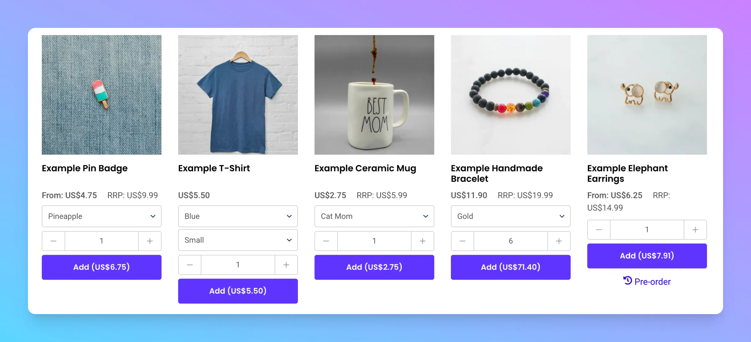
<style>
:root {
    /* Product Card */
    --spark-product-card-button-radius: 4px;
    --spark-product-card-button-padding: 0.75em 1em;
    --spark-product-card-pricing-font-size: 15px;
    --spark-product-card-pricing-font-size-small: 14px;
    --spark-product-card-select-min-height: 50px;

    --spark-product-card-stockstatus-fontsize: 16px;
    --spark-product-card-stockstatus-fontsize-small: 14px;
    --spark-product-card-stockstatus-align: center;
    --spark-product-stockstatus-back-order-display: none;

    --spark-product-card-tiered-pricing-display: flex;
    --spark-product-card-tiered-pricing-font-size: 12px;

}
</style>
Variable | Description | Default Value |
|---|---|---|
--spark-product-card-button-radius | Button radius | 4px |
--spark-product-card-button-padding | Button padding | 0.75em 1em |
--spark-product-card-pricing-font-size | Pricing font size | 15px |
--spark-product-card-pricing-font-size-small | Pricing font size on mobile | 14px |
--spark-product-card-select-min-height | Minimum height for select menu wrapper | 50px |
--spark-product-card-tiered-pricing-display | Display of tiered pricing widget | flex |
--spark-product-card-stockstatus-fontsize: | Stock status font size | 16px |
--spark-product-card-stockstatus-fontsize-small | Stock status font size on mobile | 14px |
--spark-product-card-stockstatus-align | Stock status alignment | center |
--spark-product-card-tiered-pricing-display | Tiered pricing info display | flex (use none to hide) |
--spark-product-card-tiered-pricing-font-size | Tiered pricing font size | 12px |
Dark mode
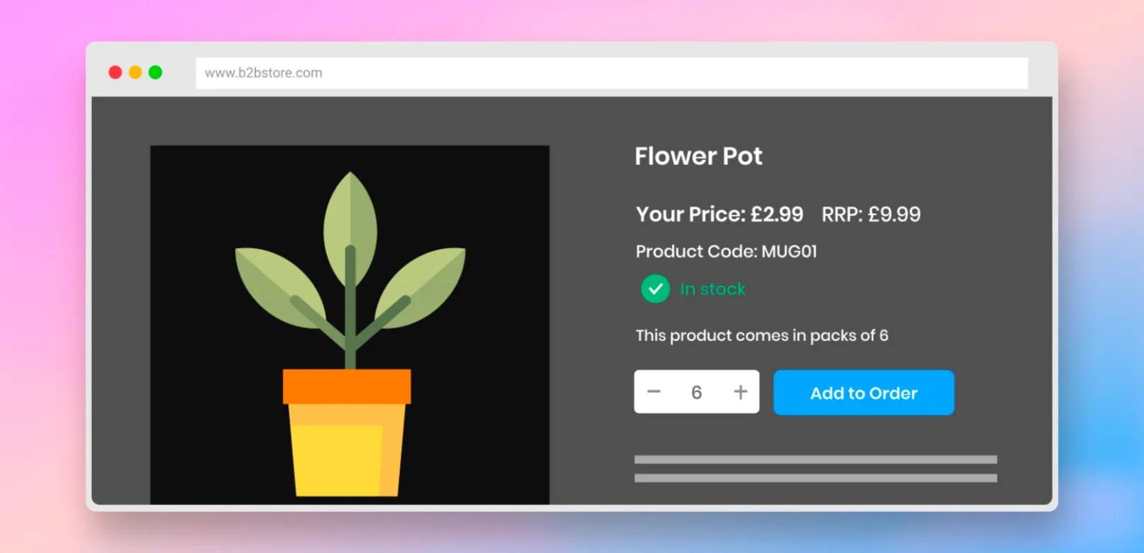
If your Shopify store theme is set up to use a dark theme, you can enable a special 'Dark Mode' in SparkLayer. Within your SparkLayer Core Script, simply add the following.
Updating the display You can update the default display by adding code to your Core Script. Learn more about how to update display settings on SparkLayer
/* Add the below code into the SparkLayer Core Script */
/* Please refer to our help guide on how to do this */
  display: {
    darkTheme: true,
    /* Other settings should show below */
  },
/* End of code */
You can also customise the look and feel by adding the following CSS overwrites.
Variable | Description | Default Value |
|---|---|---|
--spark-pdp-price-summary-color | Default price colour | #ffffff |
--spark-dark-mode-lightest-color, | Default font colour | #ffffff |
--spark-dark-mode-status-in-stock | In stock colour | #5ecfad |
--spark-dark-mode-status-back-order | Backorder colour | #96b1ef |
--spark-dark-mode-status-out-of-stock | Out of stock colour | #ff9a9a |
--spark-dark-mode-table-border-color | Table border colour | #555 |
--spark-dark-mode-table-header-background | Table header colour | #000 |
--spark-dark-mode-table-row-background | Table row colour | #333 |
--spark-dark-mode-table-row-alt-background | Table alternate row colour | #222 |
--spark-dark-mode-qty-background | Quantity box colour | #000 |
--spark-dark-mode-qty-background-hover | Quantity box hover colour | #222 |
--spark-dark-mode-qty-border-color | Quantity box border colour | #555 |
Using "slots" to extend the interface
Custom Slots (or "Targets") allow you to enhance a range of the SparkLayer Frontend Interfaces by adding your own custom code in predefined areas.
It's a great way to further enhance your B2B customer experience using SparkLayer and you can learn more in our guide here.